


Crafting Visual Narratives with Precision and Passion
I believe that every brand has a unique story waiting to be told. With a foundation rooted in fine art and a keen eye for detail, I specialize in creating logos and branding materials that not only capture attention but also resonate deeply with your audience. My commitment to a collaborative and methodical design process results in logos that are not only visually appealing but also strategically aligned with your brand identity.
My approach is a structured process that emphasizes clarity and collaboration, ensuring that each design is both innovative and timeless. Whether you're a startup seeking a distinctive identity or an established business aiming to refresh your visual presence, I am here to translate your vision into compelling branding that stands out in today's competitive landscape.
Explore my portfolio and discover how I can bring your brand's story to life with creativity and clarity.

A newly established coffee roaster and cafe needed a brand logo that perfectly expressed the quaint charm of their hometown of Holly, Michigan. The choice of decorative, Old Western-style typography gives the brand a historic, small-town Americana vibe. The overall design feels handcrafted and charming, suitable for a small, community-centered coffee shop. Thin horizontal lines run parallel above and below the text, creating structure and drawing the eye across the entire layout.
Client
Battle Alley Coffee Co., Holly, Michigan
Year
2018

Excited to start her own law practice, Ashley wanted a brand logo that was modern and sophisticated. Her vision was to create a boutique firm and a brand that reflects her identity. This logo communicates professionalism and credibility, a modern, approachable aesthetic, and sense of structure and clarity that she values within her business. Waters Law is a clean design that conveys professionalism and trust.
Client
Waters Law, Cookeville, Tennessee
Year
2019

Keeping with Bryan’s vision for the rebrand of his recruitment company, the brand logo honors the dignity of labor through its patronage of St. Joseph. The clean, flat design and minimalist lines give the logo a contemporary feel, balancing tradition with modern aesthetic. The muted colors are intentional and celebrate the religious iconography of St. Joseph. Overall, the logo reinforces the idea of quiet strength and faithful service, virtues that Bryan values within his company.
Client
St. Joseph Catholic Search, Summerville, SC
Year
2025
Frank started The Beacons to support the parents and teachers, providing a guiding presence for students with different backgrounds and needs. The brand logo needed to exude the light of the guiding presence of the mentors who serve their community. At the lighthouse’s center is a glowing heart, radiating beams of light in white and soft yellow. The heart doubles as the light source, symbolizing love, care, and hope.
Client
Beacons Mentoring, Summerville, South Carolina
Year
2023

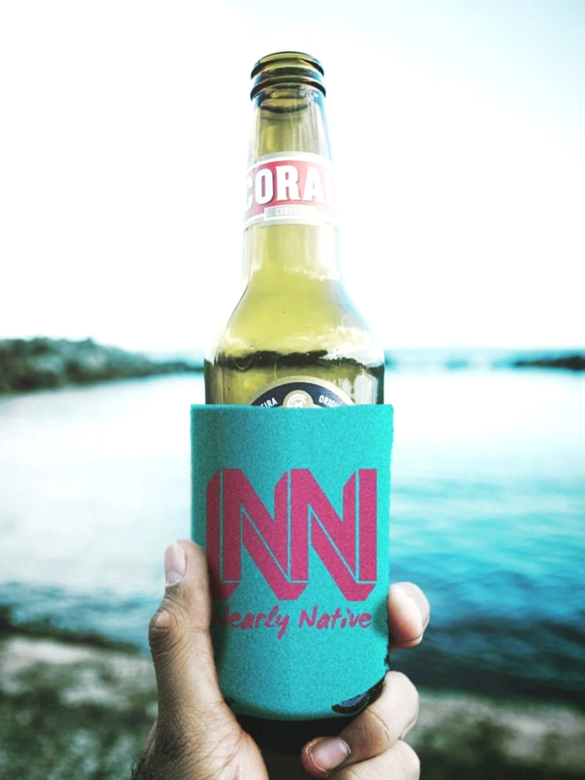
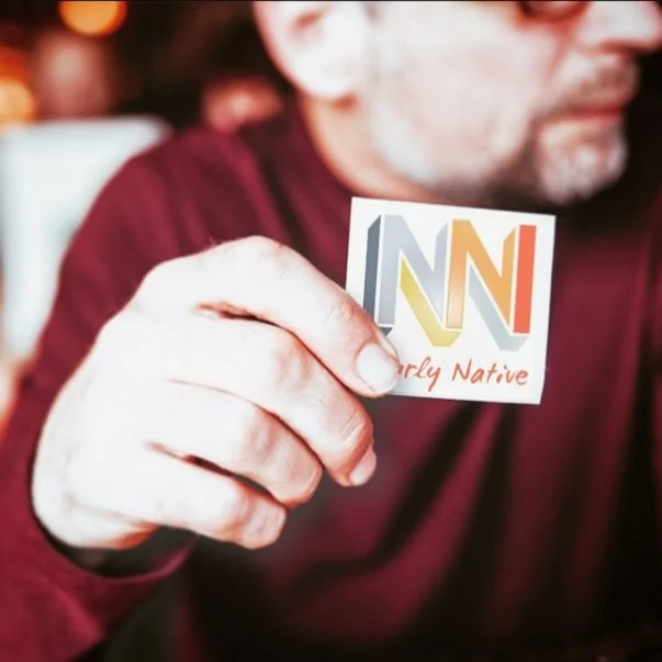
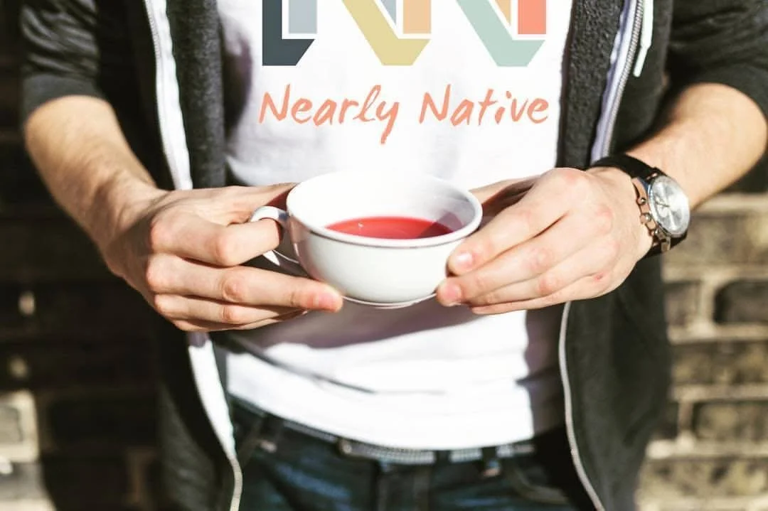
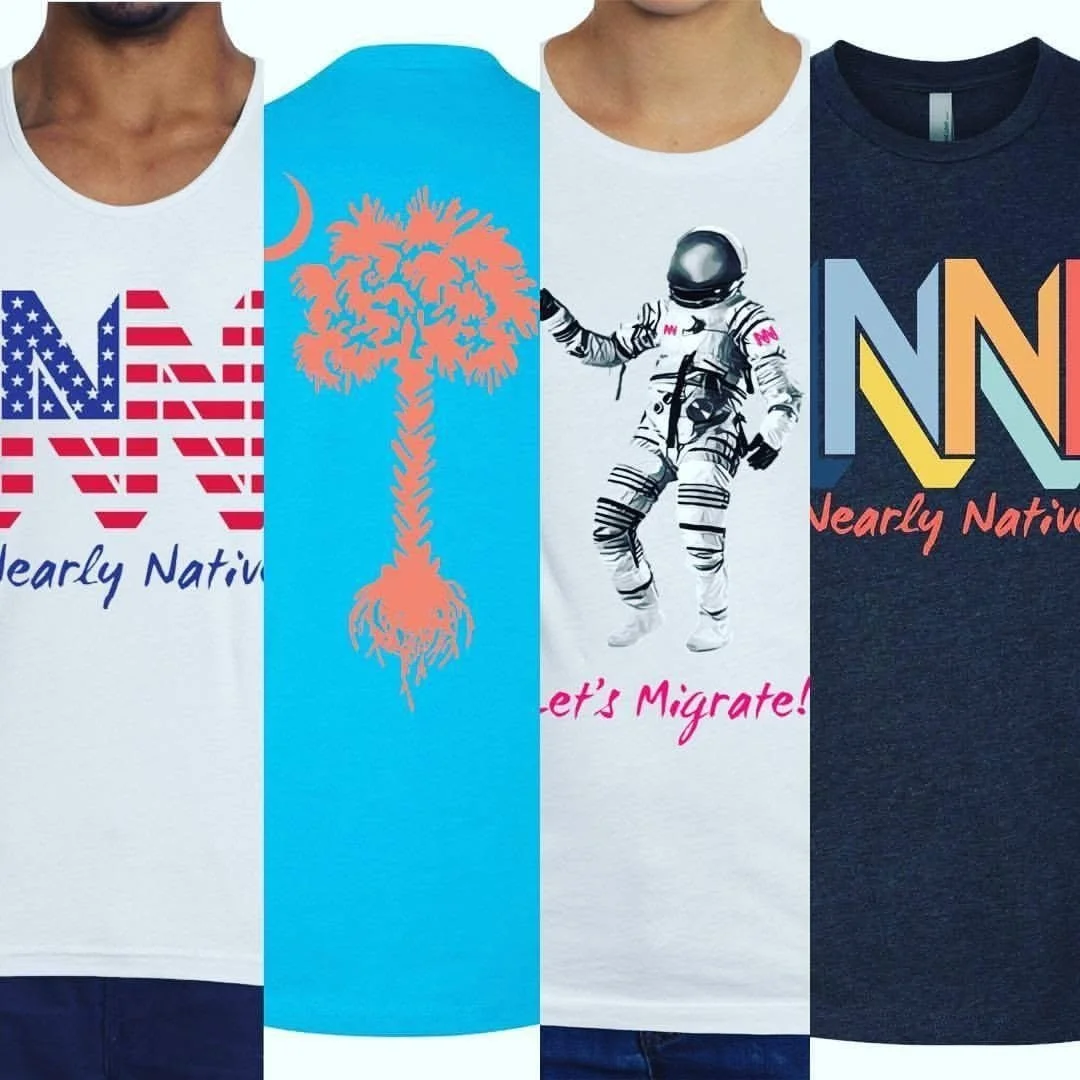
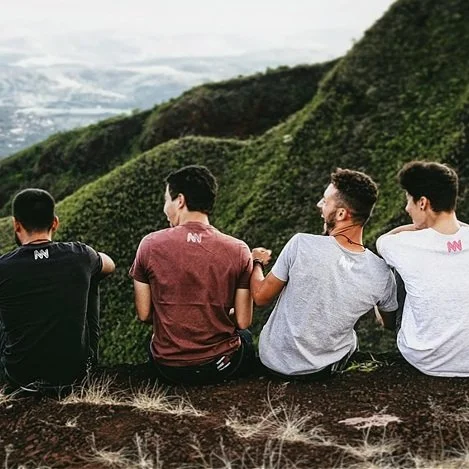
Nearly Native is an apparel brand celebrating those who strayed from home and planted new roots in new places. The brand logo is bold and stands as a strong graphic icon across all media. The letters interlock in a way that emphasizes their three-dimensional nature but creates a sense of continuous form. The diversity of colors celebrates the multicultural communities that served as the inspiration of the brand.
Client
Nearly Native, Charleston, South Carolina
Year
2016


Following the immense growth of this local community festival, the brand needed a cultivated refresh that matched the success and maturing experienced over the years. The overall feel is rustic and inviting. The logo was also designed with versatility in mind to showcase the organization’s multiple festival events. The pine limbs pay homage to the festival’s hometown of Summerville, South Carolina, the Flower Town in the Pines.
Client
Summerville Italian Feast, Summerville, South Carolina
Year
2025

Laura wanted a minimalist and refined design that effectively reflected her company’s focus on beauty. The logo’s use of clean lines, modern typography, and a monochromatic color scheme conveys a sense of professionalism and elegance. The overall design aligns well with her mission to offer personalized beauty services for events and production.
Client
Silhouette On Site, Charleston, South Carolina
Year
2015


Frank requested a campaign logo that was straightforward and effective, reflecting his commitment to transparency and community engagement. The style aims to be memorable and impactful, suitable for a political campaign where clear communication and name recognition are crucial. The use of strong colors, bold fonts, and the collegiate-style typography suggests a candidate who is strong, dedicated to education, and connected to school spirit.
Client
Frankie Staropoli for Dorchester District 2 School Board, Summerville, South Carolina
Year
2021


Chris requested a campaign logo that was bold and engaging. The style is professional yet friendly. The choice of light blue suggests a calm and reliable presence, while the touch of yellow adds a personal and approachable touch. It's designed for maximum readability and impact in a campaign setting, aiming to be easily digestible at a glance.
Client
Chris Digby for Dorchester District 2 School Board, Summerville, South Carolina
Year
2023

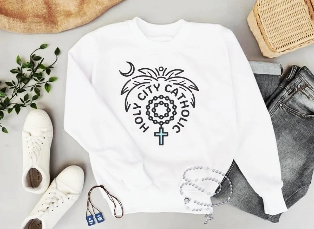
A very specific niche brand needed a logo that brought together elements of faith and community. The style is fun and lively, blending the crescent moon and palm with rosary beads in a contemporary and uncluttered manner. It evokes a sense of place and faith, celebrating Catholics located in the "Holy City” of Charleston, South Carolina.
Client
Holy City Catholic, Charleston, South Carolina
Year
2024

The logo's style is evocative and sentimental. The combination of the moon and girl's silhouette creates a serene and almost fairytale-like atmosphere, suggesting a magical and memorable event. Her gaze out of frame suggests the presence of her father. The bright color palette and mixed typography contribute to a feeling that is both grounded and enchanting, making it very appealing for the school dance.
Client
Lowcountry Christian Community School, Charleston, South Carolina
Year
2016


Public Road Wines wanted balance and a visual presence on their bottle. The image creates a polished aesthetic that is both modern and grounded, hinting at the journey or terroir of the wine without being overly literal. The intricate line work gives the illustration a hand-drawn or artisanal quality, suggesting craftsmanship and attention to detail that embodies the client’s wine-making process.
Client
Public Road Wines, McMinnville, Oregon
Year
2009


Public Road Wines created a special, limited release of Pinot Noir and Chardonnay and required labels that reflected the rebellious nature of their wine-making process. The intentional imperfection was a key design choice, aiming to break from the polished look of many wine labels. The style was designed to be a conversation starter and to appeal to a consumer looking for something daring and different. It subverts the traditional elegance of wine labels, suggesting a wine that might itself be unconventional, bold, and a humorous critique of the wine industry, implying a deconstruction or reinterpretation of the grape. It's rebellious and memorable.
Client
Public Road Wines, McMinnville, Oregon
Year
2011