


Crafting Visual Narratives with Precision and Passion
Your logo should do more than look good. It should help people understand, trust, and remember your brand. They start with a story, a purpose, and a vision for where they're going.
I help businesses uncover what makes them unique and translate that into a visual identity that people remember. Combining a background in fine art with strategic brand thinking, I create logos, websites, and brand systems that do more than look good—they build trust, communicate value, and create lasting connections with your audience.
My process is collaborative, thoughtful, and rooted in understanding your business. Every design decision is intentional, ensuring your brand not only stands out today but remains relevant for years to come. Whether you're launching a new venture, growing an established company, or redefining your identity, I work alongside you to create a brand that reflects who you are and where you're headed.
Your brand deserves more than a generic design. It deserves a story worth remembering.
Let's build something meaningful together.


Client: Battle Alley Coffee, Holly, Michigan
Year: 2018
Need: A distinctive brand identity that captured the historic charm and small-town character of Holly, Michigan.
Solution: Designed a vintage-inspired logo featuring classic Western-style typography, handcrafted details, and balanced linework that reflects the town’s heritage and community-focused spirit.
Result: A memorable brand mark that evokes warmth, authenticity, and hometown pride while providing a strong foundation for signage, packaging, merchandise, and café branding.


Client: Waters Law, Cookeville, Tennessee
Need: A sophisticated brand identity for a new boutique law firm that reflected Ashley's professional expertise and personal approach.
Solution: Created a clean, modern logo system that balances professionalism with approachability, using refined typography and a structured design that communicates clarity, confidence, and trust.
Result: A polished brand identity that positions Waters Law as a credible, client-focused practice while providing a strong foundation for web, print, and professional marketing materials.

Client: St. Joseph Catholic Search, Summerville, South Carolina
Need: A recruitment brand that reflected Catholic values while honoring the dignity of work and faithful service.
Solution: Developed a modern identity inspired by the patronage of St. Joseph, combining minimalist design, subtle religious symbolism, and a restrained color palette that balances tradition with a contemporary aesthetic.
Result: A distinctive brand that communicates integrity, purpose, and quiet strength, helping the company stand apart while reinforcing its mission-driven approach to recruiting and talent placement.
Client: Beacons Mentoring, Summerville, South Carolina
Need: A compassionate and uplifting brand identity that reflected the organization's mission of guiding and supporting students, families, and educators.
Solution: Created a lighthouse-inspired logo centered around a radiant heart, symbolizing the love, encouragement, and steady guidance mentors provide to their community. Soft, welcoming colors and clean forms reinforce a sense of hope, trust, and connection.
Result: A meaningful brand identity that visually captures the organization's purpose and serves as a recognizable symbol of mentorship, support, and positive impact.

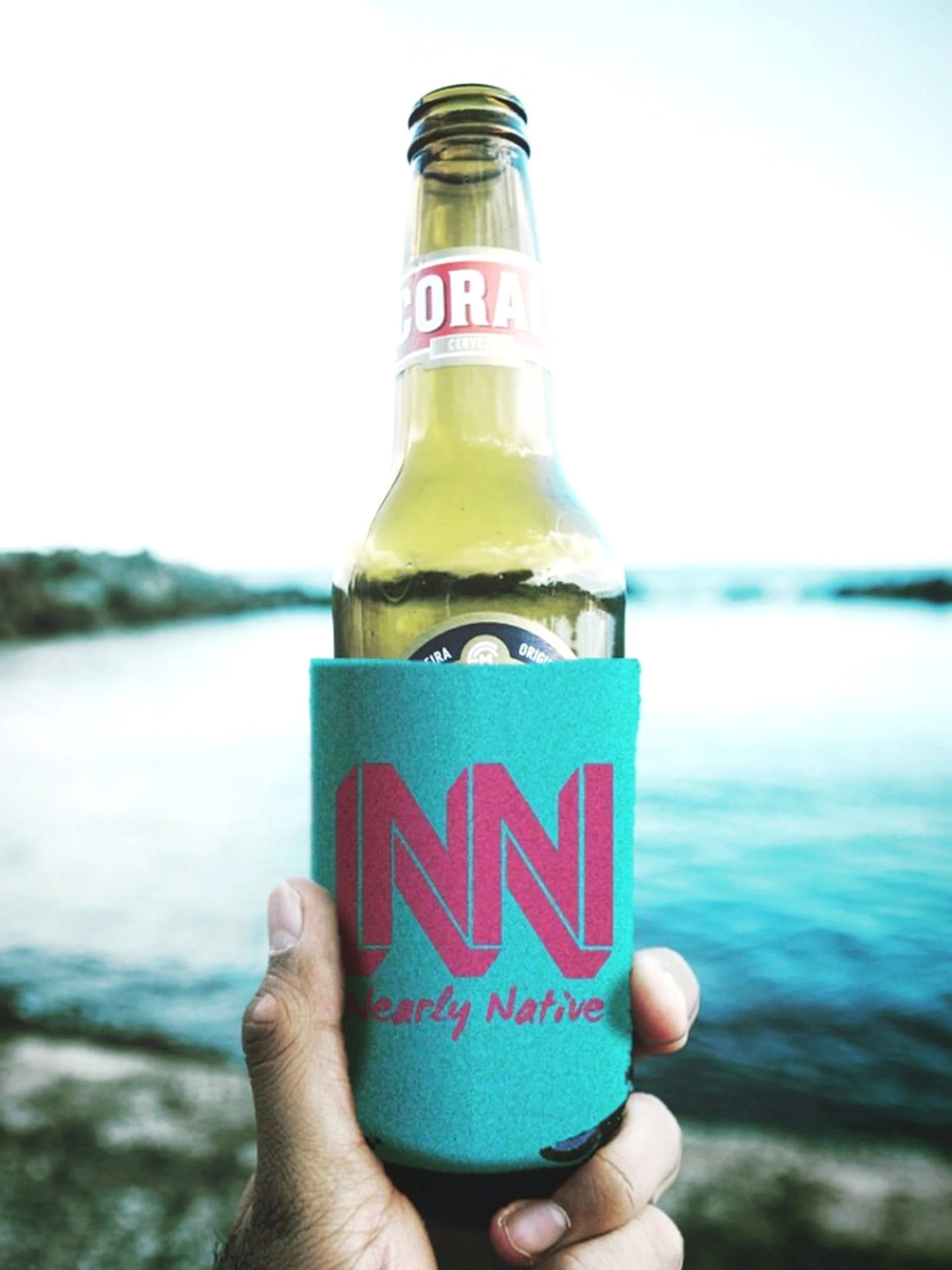
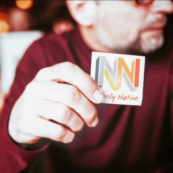
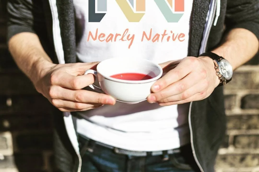
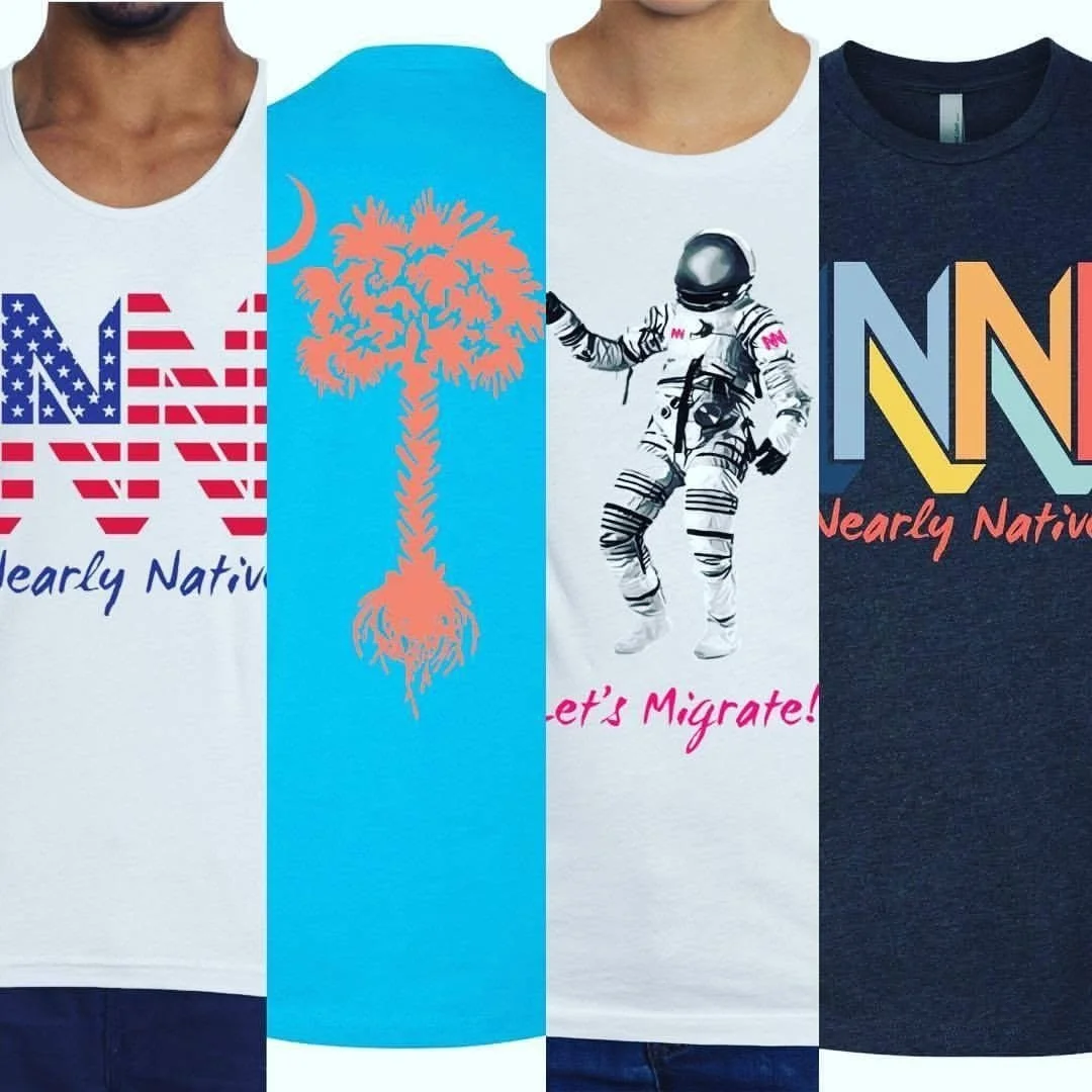
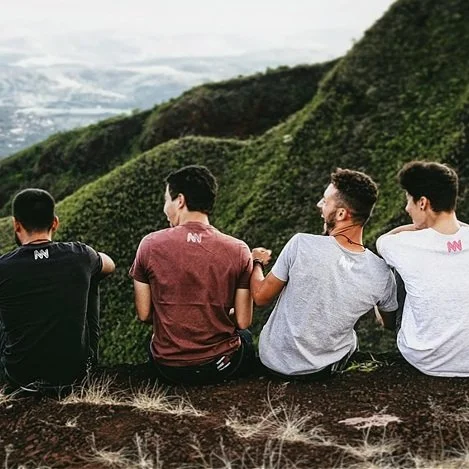
Client: Nearly Native, Charleston, South Carolina
Need: A bold lifestyle brand identity that celebrated people who have built new lives, communities, and connections far from where they started.
Solution: Designed a distinctive, interlocking monogram that creates a strong, continuous form while emphasizing depth, movement, and connection. A vibrant, multicultural color palette reflects the diversity of the people and communities that inspired the brand.
Result: A memorable and versatile brand mark that stands confidently across apparel, digital platforms, and merchandise while reinforcing the brand's message of belonging, identity, and putting down new roots.


Client: Summerville Italian Feast, Summerville, South Carolina
Need: A refreshed brand identity that reflected the festival’s growth while honoring its community roots and long-standing traditions.
Solution: Developed a warm, rustic visual identity inspired by Italian heritage and the welcoming spirit of the festival. Pine elements were incorporated to celebrate Summerville’s nickname, "The Flower Town in the Pines," while the logo system was designed to adapt seamlessly across the festival’s various events and programs.
Result: A versatile and recognizable brand that elevates the festival’s presence, strengthens community engagement, and provides a cohesive identity for future growth.

Client: Silhouette On Site, Charleston, South Carolina
Need: A sophisticated brand identity that reflected the company’s focus on beauty, artistry, and personalized client experiences.
Solution: Created a refined, minimalist logo featuring clean lines, modern typography, and a timeless monochromatic palette. The design balances elegance with professionalism, aligning with the brand’s commitment to delivering high-quality beauty services for events, productions, and special occasions.
Result: A polished and versatile identity that communicates confidence, style, and expertise while providing a strong visual foundation across digital, print, and promotional materials.
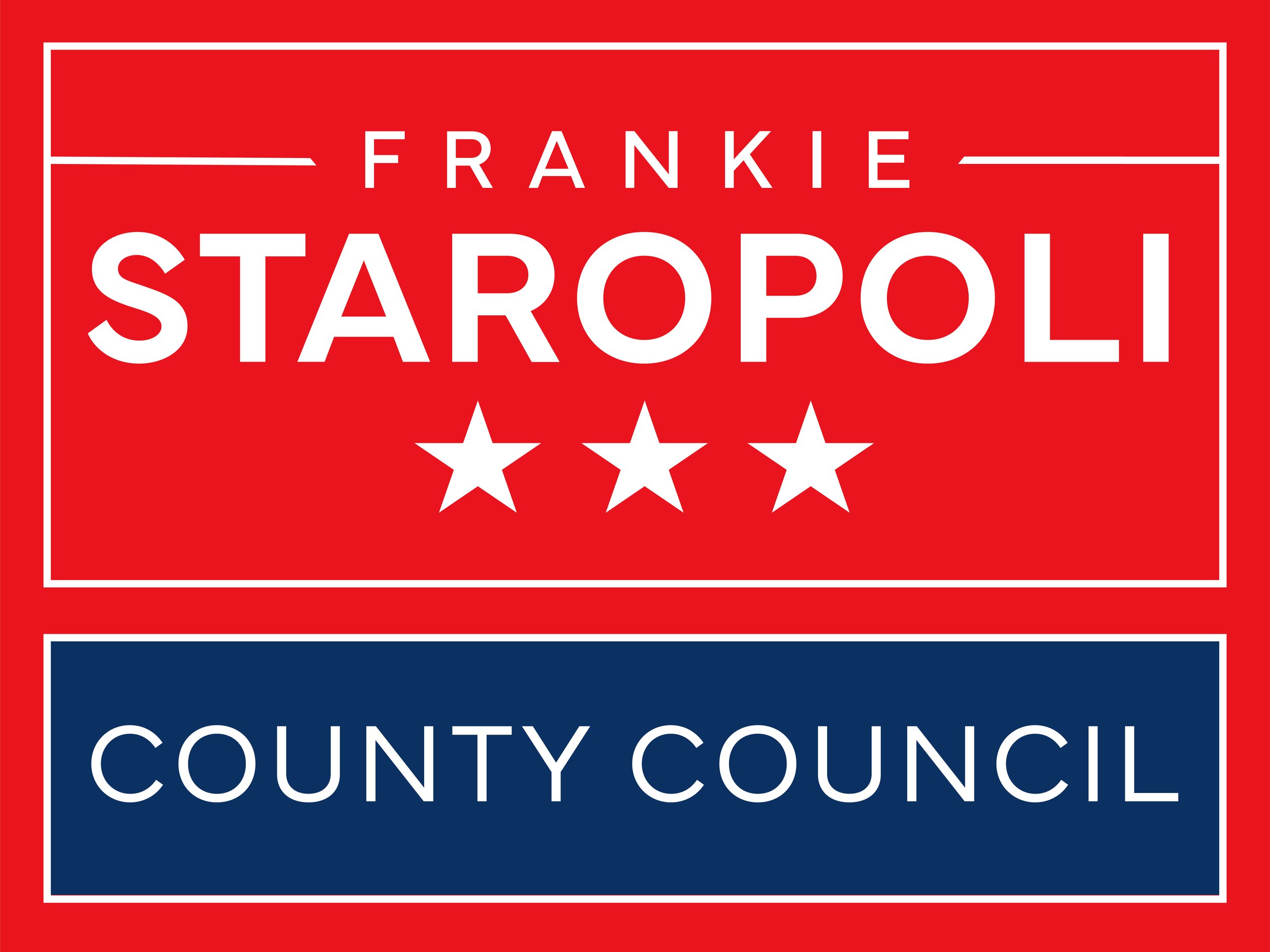
Client: Frankie Staropoli for Dorchester District 6 County Council, Summerville, South Carolina
Need: A professional campaign identity that communicated leadership, credibility, and trust while standing out across signage, print, and digital media.
Solution: Designed a clean, contemporary campaign brand featuring bold typography, patriotic color accents, and a straightforward visual hierarchy that kept the candidate’s name and office front and center. Simple geometric forms and subtle civic-inspired elements reinforced a message of confidence, accessibility, and public service.
Result: A memorable and highly effective campaign identity that built strong recognition throughout the community—and helped carry the campaign to a successful election victory.

Client: Frankie Staropoli for Dorchester District 2 School Board, Summerville, South Carolina
Need: A campaign identity that emphasized trust, visibility, and a strong commitment to public education and community involvement.
Solution: Created a bold, straightforward campaign logo centered on clear communication and strong name recognition. Collegiate-inspired typography, confident colors, and a clean layout reinforced themes of leadership, school pride, and dedication to students, families, and educators.
Result: A memorable campaign brand that connected with voters, strengthened community recognition, and effectively supported the candidate’s message across signs, print materials, and digital platforms.
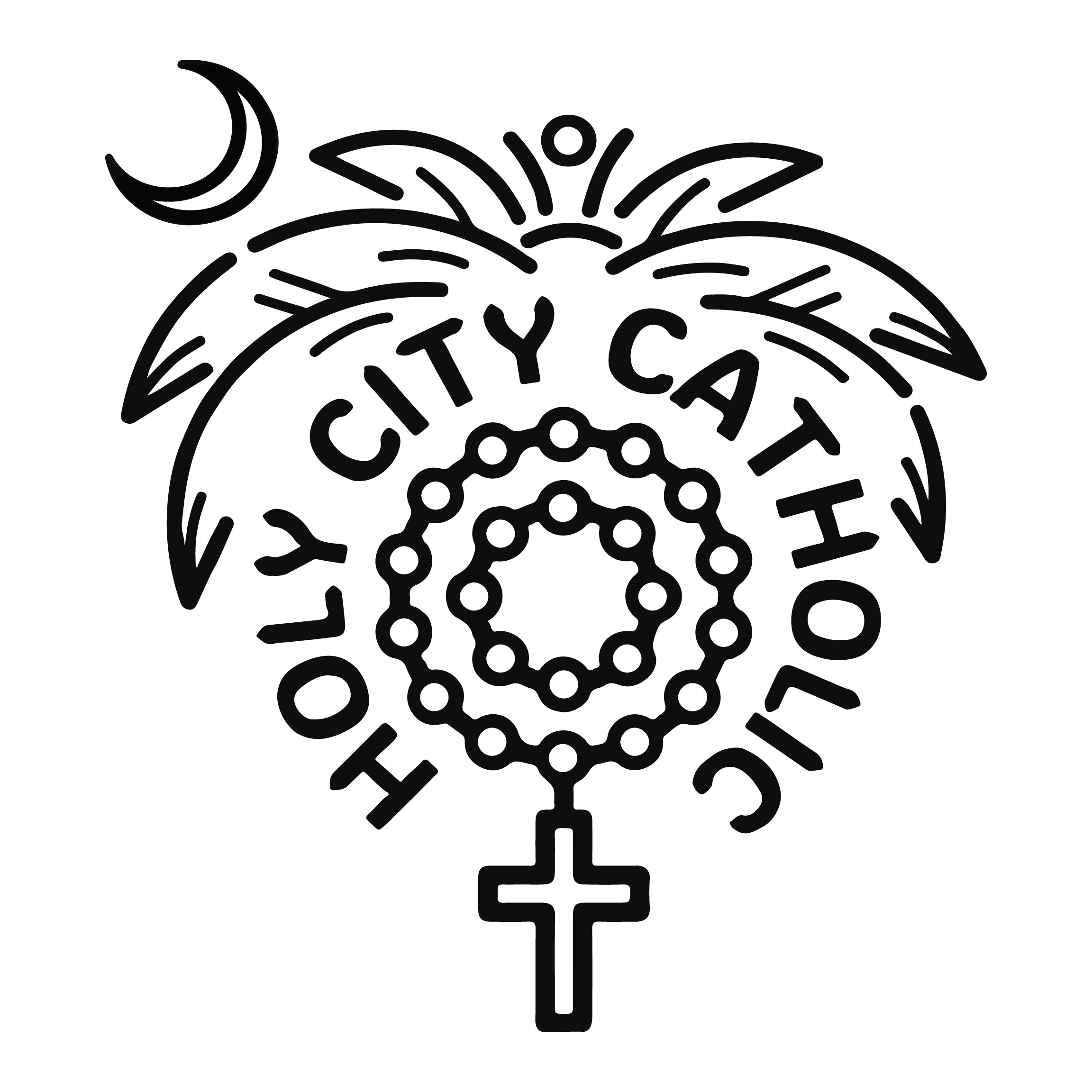
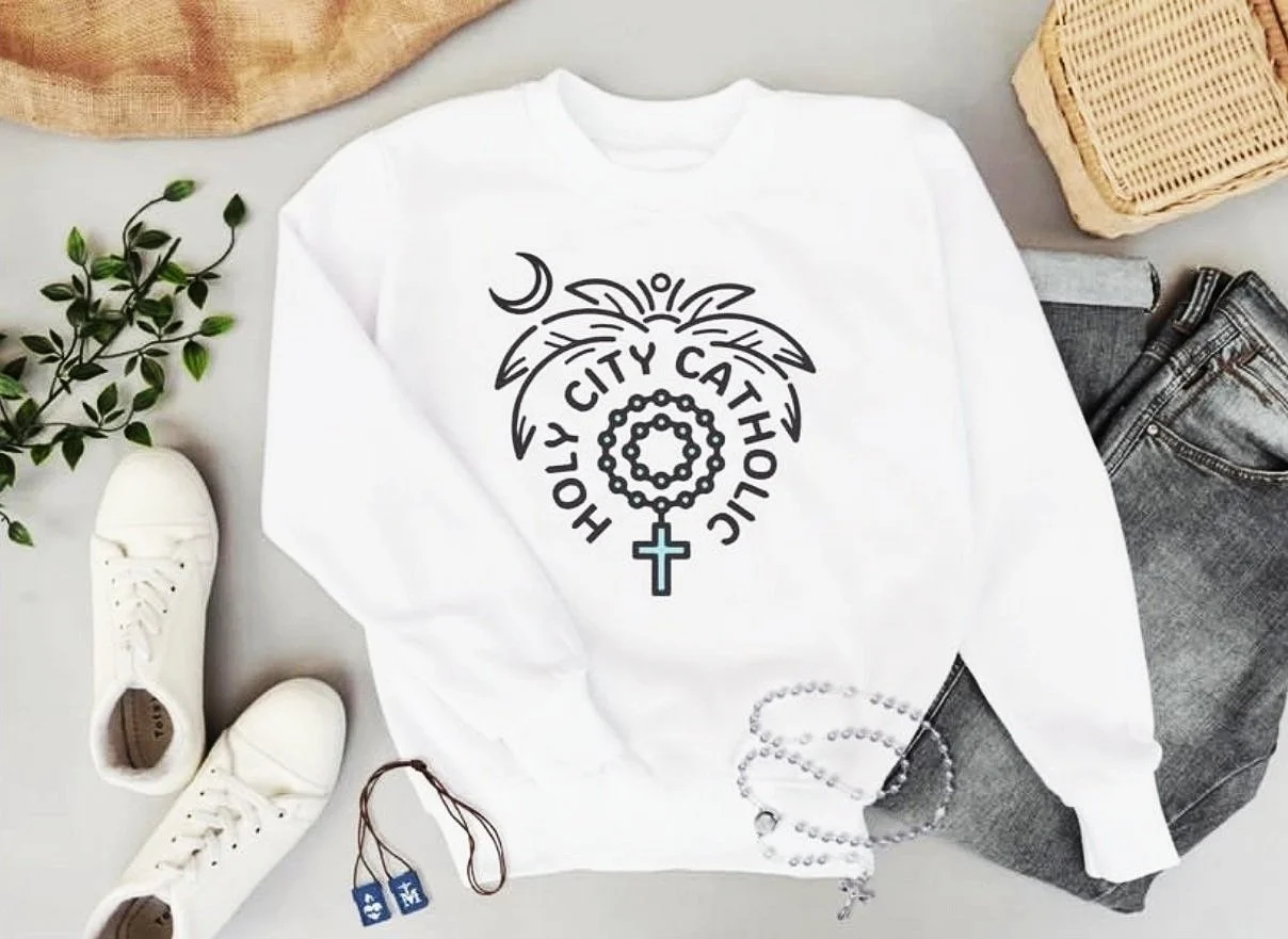
Client: Holy City Catholic, Charleston, South Carolina
Need: A distinctive brand identity that connected Catholic faith with the culture, history, and community of Charleston, South Carolina.
Solution: Created a modern, approachable logo that combines local and religious symbolism through the integration of a crescent moon, palm tree, and rosary beads. The clean, uncluttered design balances faith and place while maintaining a fun, welcoming personality that appeals to a contemporary audience.
Result: A memorable brand mark that celebrates Charleston’s Catholic community and provides a versatile foundation for apparel, merchandise, social media, and future brand growth.

Client: Lowcountry Christian Community School, Charleston, South Carolina
Need: A memorable event identity that captured the excitement, wonder, and emotional significance of a cherished school tradition.
Solution: Designed an evocative logo featuring a silhouetted figure beneath a moonlit sky, creating a sense of anticipation, warmth, and storytelling. A bright, inviting color palette and complementary typography balanced elegance and playfulness, reflecting the special bond celebrated through the event.
Result: A distinctive event brand that resonated with students and families, helping create a memorable experience while providing cohesive visuals for promotional materials, signage, and keepsakes.


Client: Public Road Wines, McMinnville, Oregon
Need: A distinctive label identity that conveyed craftsmanship, character, and a strong shelf presence while reflecting the winery’s story and sense of place.
Solution: Created an intricate, hand-drawn illustration that balances modern refinement with artisanal detail. The composition evokes themes of journey, landscape, and terroir without being overly literal, allowing the brand’s narrative to unfold through thoughtful linework and visual texture.
Result: A sophisticated wine label that stands out on the shelf, reinforces the winery’s commitment to quality and craftsmanship, and creates a memorable visual experience for customers.


Client: Public Road Wines – Limited Release Series
Need: A bold label design for a special release of Pinot Noir and Chardonnay that challenged convention and reflected the winery’s unconventional approach to winemaking.
Solution: Developed a deliberately imperfect and disruptive visual style that rejected traditional wine-label elegance in favor of something raw, expressive, and thought-provoking. The design embraces humor, experimentation, and visual tension, creating a label that feels as rebellious and distinctive as the wines themselves.
Result: A memorable limited-edition label series that sparked conversation, differentiated the wines on the shelf, and reinforced the brand’s reputation for creativity, authenticity, and challenging industry expectations.